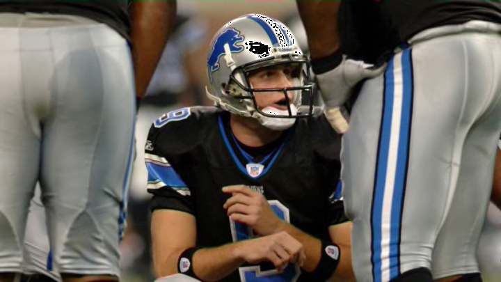
Now that the dust has settled on the Detroit Lions’ new identity, here is my review of the team’s new look

The Colors. “And when the blue and silver and black wave” doesn’t roll off the tongue as well as “and when the blue and silver wave” as heard in the The Detroit Lions’ fight song “Gridiron Heroes”. Black never belonged within the Lions color pallet and thankfully the team has eliminated it, returning to the classic Honolulu blue and silver look.
Black was put into the Lions’ logos and uniforms by former general manager Matt Millen, who many believe wanted to install the black as homage to his playing days with the Oakland Raiders. And while black usually goes with everything, it never was a fit with the Lions.
There is just something about the combination of Honolulu blue and silver that simply works. Not only did the black reek of the horrors of the Millen Era, but Honolulu blue is a shade unique to the Lions and it was being overshadowed by the black. Detroit has one of the best color schemes in the NFL and they’ve finally gone back to embracing it with the removal of black from their identity.
The Logo and Wordmark
The Lions made a minor change to their primary logo by removing black from the outline of Bubbles, the leaping Lion, (are we still calling him Bubbles? I like calling him Bubbles). The logo is now outlined in silver, which is an instant upgrade.
The logo had last been updated in 2009 when the team gave Bubbles a fierce facial expression along with some detailing. The Lions did an exemplary job of modernizing a classic logo with these logo tweaks and I’m happy they kept this current iteration of Bubbles relatively unchanged.
One of the bigger alterations to Detroit’s brand comes in the form of a sexy new wordmark. In my opinion, the greatest Lions wordmark was the classic “Western” style used from 1970 until 2008.
I would have been happy if the Lions brought back the “Western” style and maybe cleaned it up a bit, but instead we have this new beauty. At first I wasn’t sold on this serif centric wordmark, but its definitely grown on me and I consider it a significant improvement on the previous font.
A critique of the new wordmark is that it seems to spell “LIOnS” because the “N” used is not a capital letter while the rest of the letters look to be capitalized. This doesn’t really bother me and I believe it gives the wordmark some character. The new font and number set can both be found on the new and improved uniforms discussed next.
